Motley is an international, multicultural, inclusive and accessible meeting place that offers a wide range of weekly courses and workshops in English for all ages. The project started when Anu Liisanantti and Anna Anttinen returned to Finland after many years abroad and found a lack of activities available in English - for both adults and kids in Helsinki.
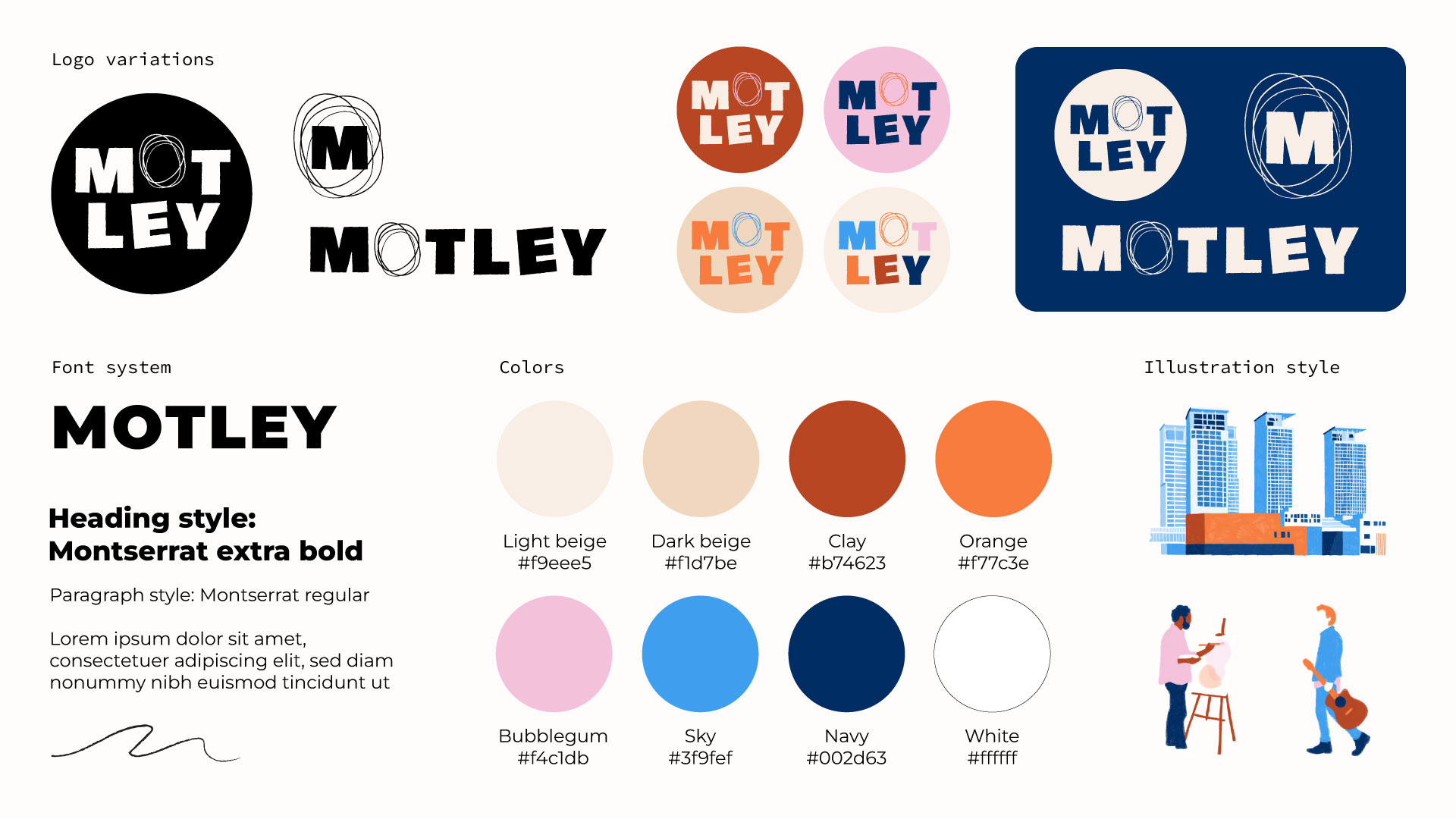
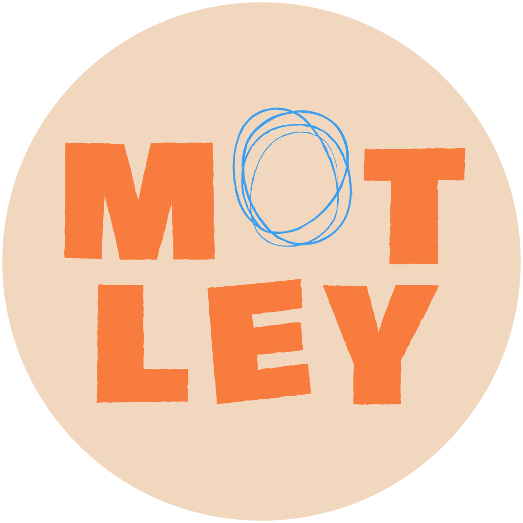
Motley means incongruously varied in appearance or character and reflects both the core idea of the project as well as the core of the branding. The brief was to create a logo for the brand and some Helsinki-themed illustrations with a human element, matching the logo and brand colors.
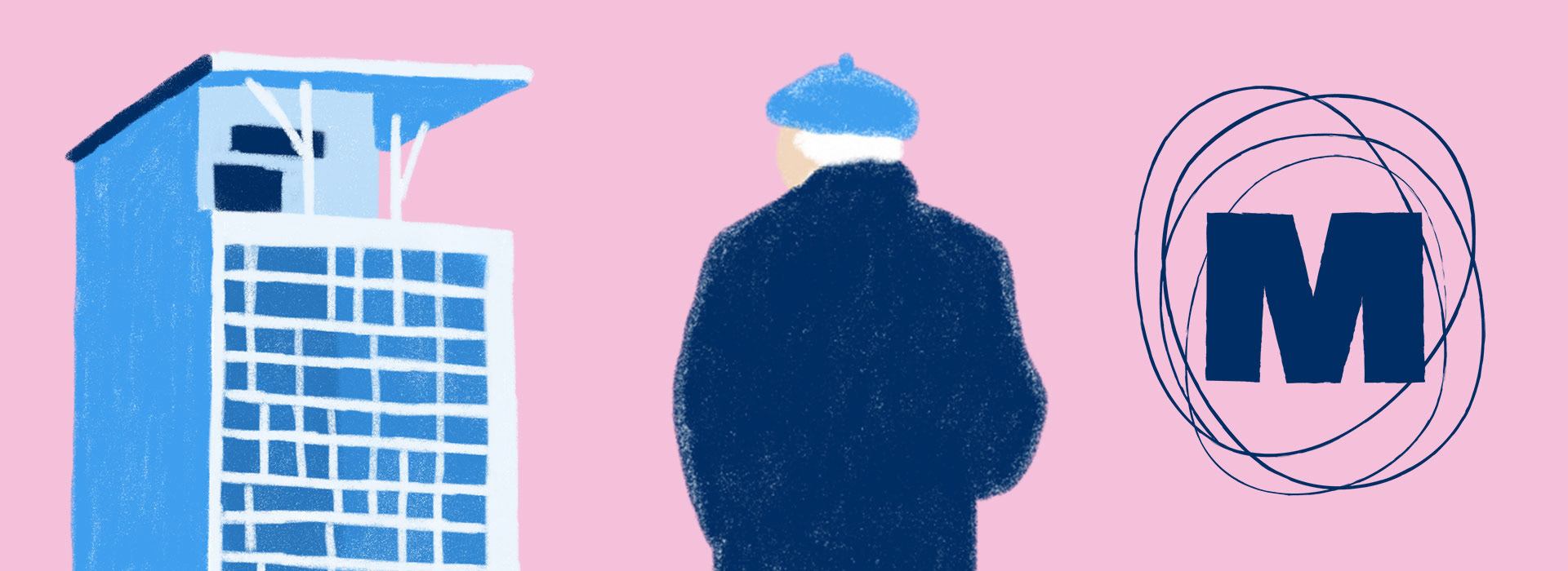
Motley being centered around creativity and the word itself reflecting variety, it was clear that the logo and illustration style needed to have texture and bold colors. The logo features a bold handdrawn font with the character "O" made up from some sketchy pencil lines. The logo is available in a variety of brand color combinations in addition to a plain light and dark version. The brand font Montserrat is widely available and clean, forming a solid base without drawing too much attention from the bright colors and intricate illustrations.
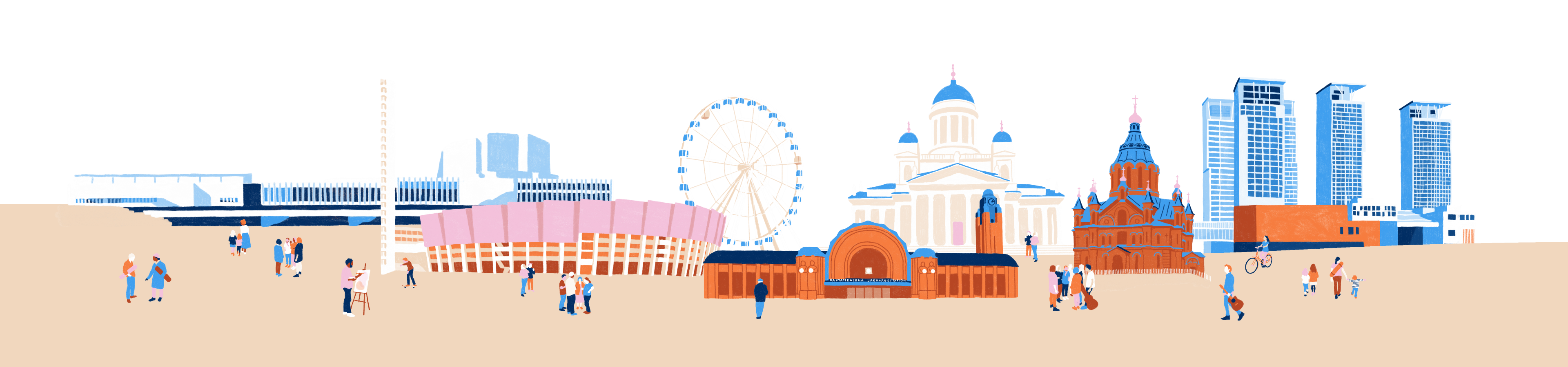
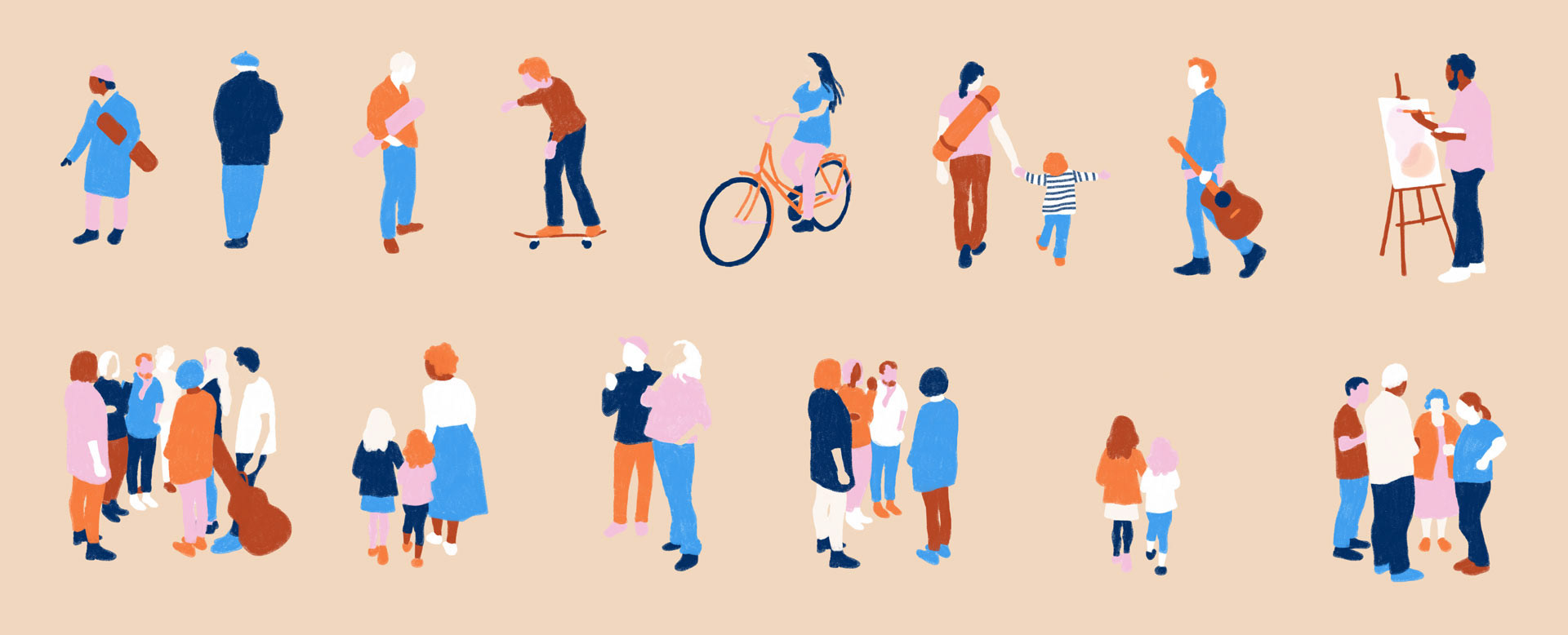
The main illustration features a skyline with Helsinki's key landmarks, including finlandia hall, the olympic stadion, skywheel, the central train station, white cathedral, uspenski cathedral and the kalasatama skyscrapers. The illustration is populated with people in groups or carrying various items, like yoga mats, instruments and paiting equipent, hinting towards the type of workshops Motley offers.
The illustrations are handdrawn digitally with a colored pencil texture, using the brand colors. The slightly non-straight lines and imperfect fill of the shapes give character and fit into the varied nature of Motley as a brand.
In addition to the main illustration, each of the buildings and people can be used as a standalone asset, forming a modular system for the brand to create visuals for social media, flyers and pitch decks. Working with a small brand, this type of versatility is key in making the brand elements applicable and easy to use in as many circumstances as possible, whithout having to hire additional help from externals.
In addition to the main illustration, each of the buildings and people can be used as a standalone asset, forming a modular system for the brand to create visuals for social media, flyers and pitch decks. Working with a small brand, this type of versatility is key in making the brand elements applicable and easy to use in as many circumstances as possible, whithout having to hire additional help from externals.

If you want to learn more about Motley and follow their journey, connect with them on Instagram.